Sunday, March 3, 2013

One Short Day in the Emerald City.....

...Or three, but it feels like one. I had a really great time, talking to the artists in the exhibitors hall. I only made it to one panel (Titmouse was unveiling some of their new projects, and I am excited! You have to have respect for a company that doesn't ship there animation overseas, and isn't afraid to...well do what they want), but there was so much to see and so many people to talk to. It was very inspiring! Brittney Lee and Mike Yamada were there, and I got to talk to them for a bit, and I met another super talented artist from California that I'd never heard of before (but will stalk like a creeper now that I have), Steph Laberis, who was super nice as well! Check out her work, it's great!

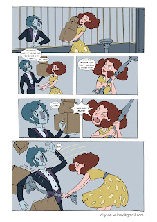
Anyway.... Here's some work that's been a long time coming. With graduation and everything, this blog has been super neglected, but I have no excuses now! Here's some work I did for another short comic last year, starting with some character development. The comic is called the Unexpected Roommate, in which a lady moved into a haunted house and its inhabitant promptly falls in love with her. 


Here's the comic pages....

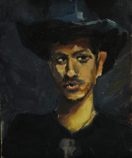
And here are a couple portraits of the two main characters...


.....which, by the way are available to purchase prints of here, along with a lot of other great work by a slew of talented artists, to support the Leukemia & Lymphoma Society. This is only going for the next couple weeks, so jump on that if you're interested!

Sunday, April 8, 2012

The Adventures of Sugarnaut and Buzzerbeam


Here's my final project from the Comics Class I too last term, taught by Matt Dryer from Dark Horse Comics. This was an experience I learned a lot from. We started with writing the script and went through the whole comics process from penciling, to inks, color, and laying them out for print. The line art you're seeing is my 2nd draft of them. I did the first with a crow quill, but I didn't really get the look I was going for (a Bruce Timm like look) so I did them again with a brush pen. My goal is to be able to do this next time with a brush and ink. This was colored in photoshop and lettered with Illustrator. I'm taking another graphic novel class this term, so hopefully I'll have another one up at the end.

Tuesday, September 20, 2011

Summer Term: Painting on Location

So highlights for the busy Summer term were Painting on Location and Conceptual Design. This was an interesting class because it's the first time I've painted with oils and they were interesting to get used to. Here's some of the painting on location work I liked more. 

Statue of Teddy Roosevelt at the Park Blocks

View from Pittock Mansion

Rock at Arcadia Beach

Riverfront Park in Salem, OR

View from Waterfront Park 

Painting of a Clothed Model

Thursday, June 16, 2011

Operation Peanut Butter

So this term has been a whirl of fun. Here's something I've been working on while I've been in radio silence from this blog. It's a production made with OPB that my advanced flash class and some other really great animator's have been working on for that last 11 weeks, so give it a looksie and enjoy! :)

http://news.opb.org/mt-hood-inc/mt-hood-missing/

Episode one is the only one up as of today, but they will be revealing the other four episodes daily.

Monday, March 28, 2011

Spring Break


This is a character I'm working on rigging in Flash right now. I wasn't too happy with the last rig I made for my Flash class last term (it was way too complicated for this program) so I'm going to try and rig this one by the end of the break.  My goal was to do something simple, and I took some inspiration from the that paper illustration I did. I think it was pretty successful... and a whole lot more fun than the last one was.

Now to the rigging :)

Thursday, March 24, 2011

Welcoming Spring Flowers


Today marks the end of a busy winter term for me, so I thought I'd get around to posting this. When Lee said we had to do collage, I was a little less than thrilled, but this ended up being a favorite of the entire term for me. When I started this, I was just trying to get a solid, simplified form, that looked animated. Thinking about that was a good practice for me so I want to try to do this again soon. 

This was done with cardstock, fabric, and a fake rose.

Also, a person that I looked to for inspiration is Brittney Lee, blog here. She's definitely worth a looksie if you haven't seen here stuff before. I will never have that kind of skill with paper.

Monday, February 21, 2011


Here's the final for costumed figure drawing this week. I'm happy with it, but I think if I have some time, I'll give it another go. The application of the ink is a little sloppy, and the line quality (what I was focusing on) isn't quite there. I actually like the line quality more in the study, which is why I included it. This week I was trying for a Bruce Timm look, and while I'm starting to get a handle on the line weight, I think I could push the figure a little more.

This was done with pen and ink.